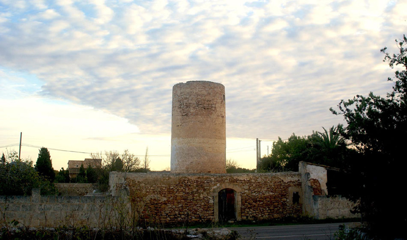
Branding
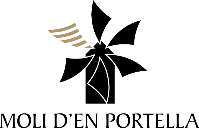
It's taken a couple of goes, but here is the final Moli d'en Portella logo in all its glory. The main change is the font; originally we were using Franklin Gothic Condensed for the logotype, but on the vehicles it looked a little non-descript to say the least, so we've evolved the main logo to use Baker, with its evocation of moving air.
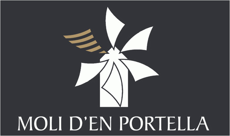
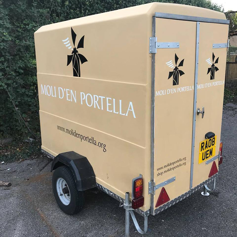
Developed by Jon Laurie, the logo will feature on all printed and digital material as well as the windmill's support vehicles. Here's the smallest of the trailers featuring the new branding.
